Structure and Subtle Details - Jenny Grettve A/W 2013

When we first wrote about Jenny Grettve earlier this year, we loved the pops of neon and mirrored prints that she was producing for her
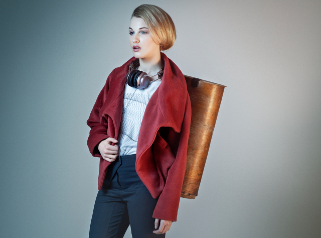
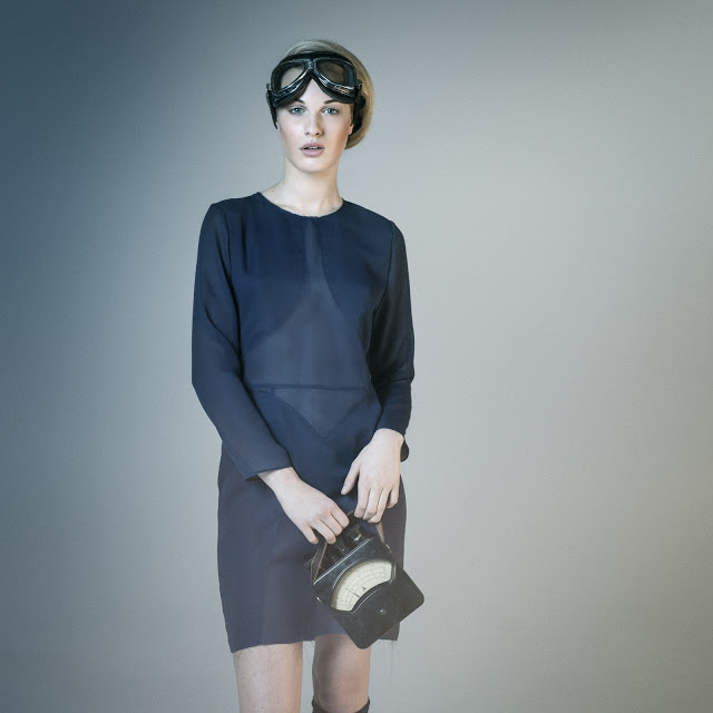
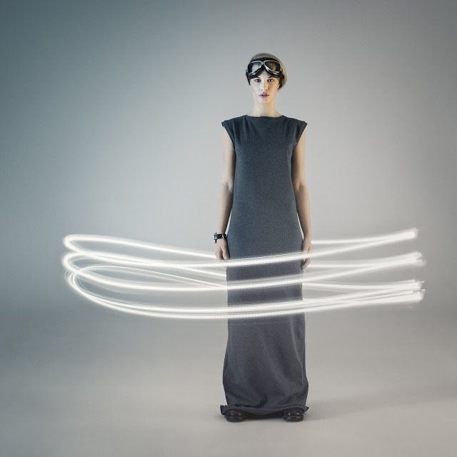
. For Fall/ Winter 2013, the brand moved towards a darker color scheme and has produced garments in a more structured style showing off Ms. Grettve's diverse design skills.
Jenny Grettve has a knack for coming up with cool prints, and construction techniques. It must be her work as an architect that lends itself to perfectly fitted shoulders, fabric cutouts and graphic design. The A/W 13 lookbook is noticeably edgier than the S/S line which contained mostly white, flowy dresses and tops. In contrast, the jackets are angular with oversized collars and the dresses are pretty and subtle at first glance with well thought out details that make them beautiful design pieces. In the first look you can also see a t-shirt with an awesome line-based geometric print. We think she's hit the ball out of the park for the past two seasons and we're already looking forward to seeing what's next! Take a look at more of the looks below and shop the current collection on the
.
Photographs by Felix Gerlach


